

Reflection:
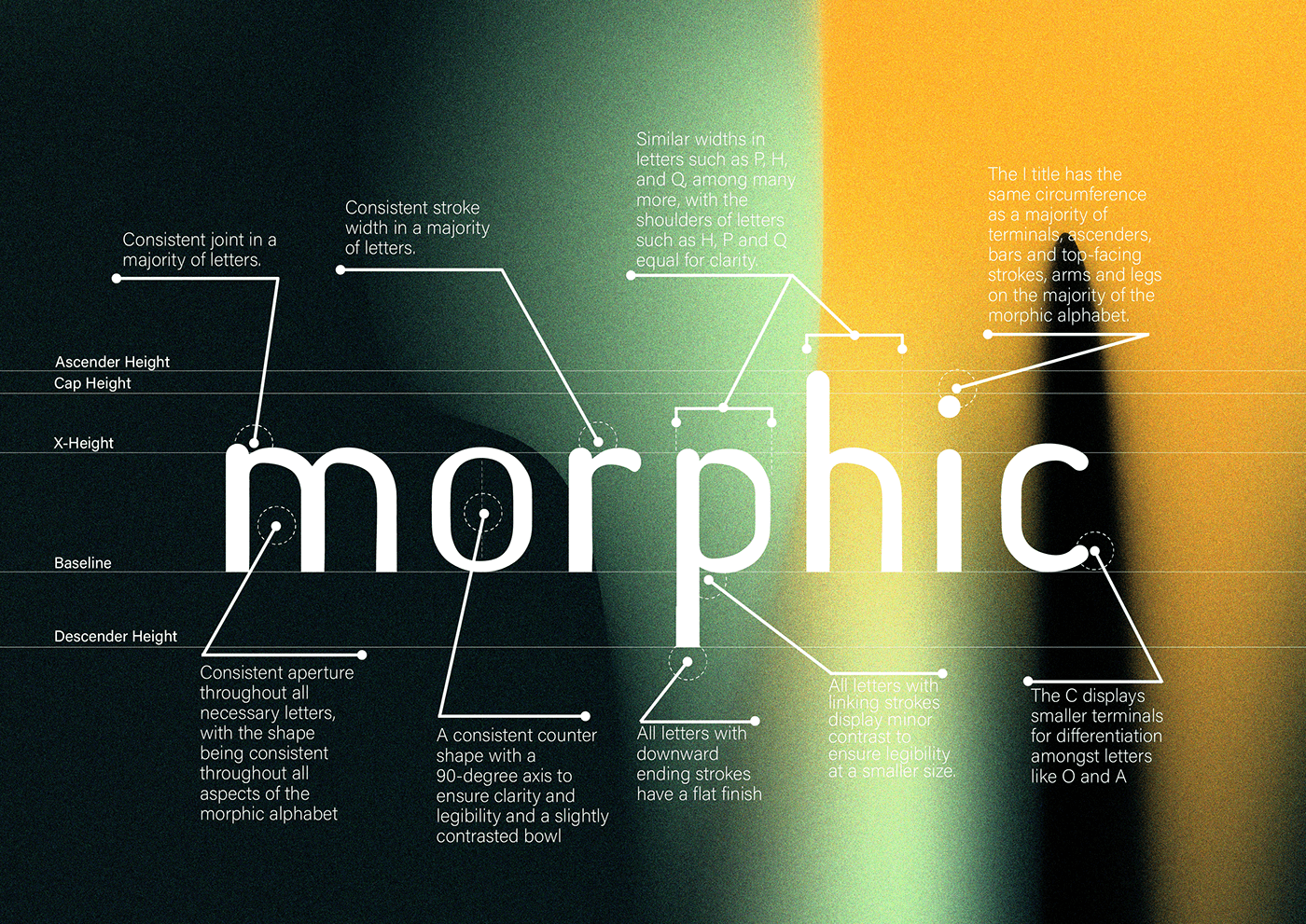
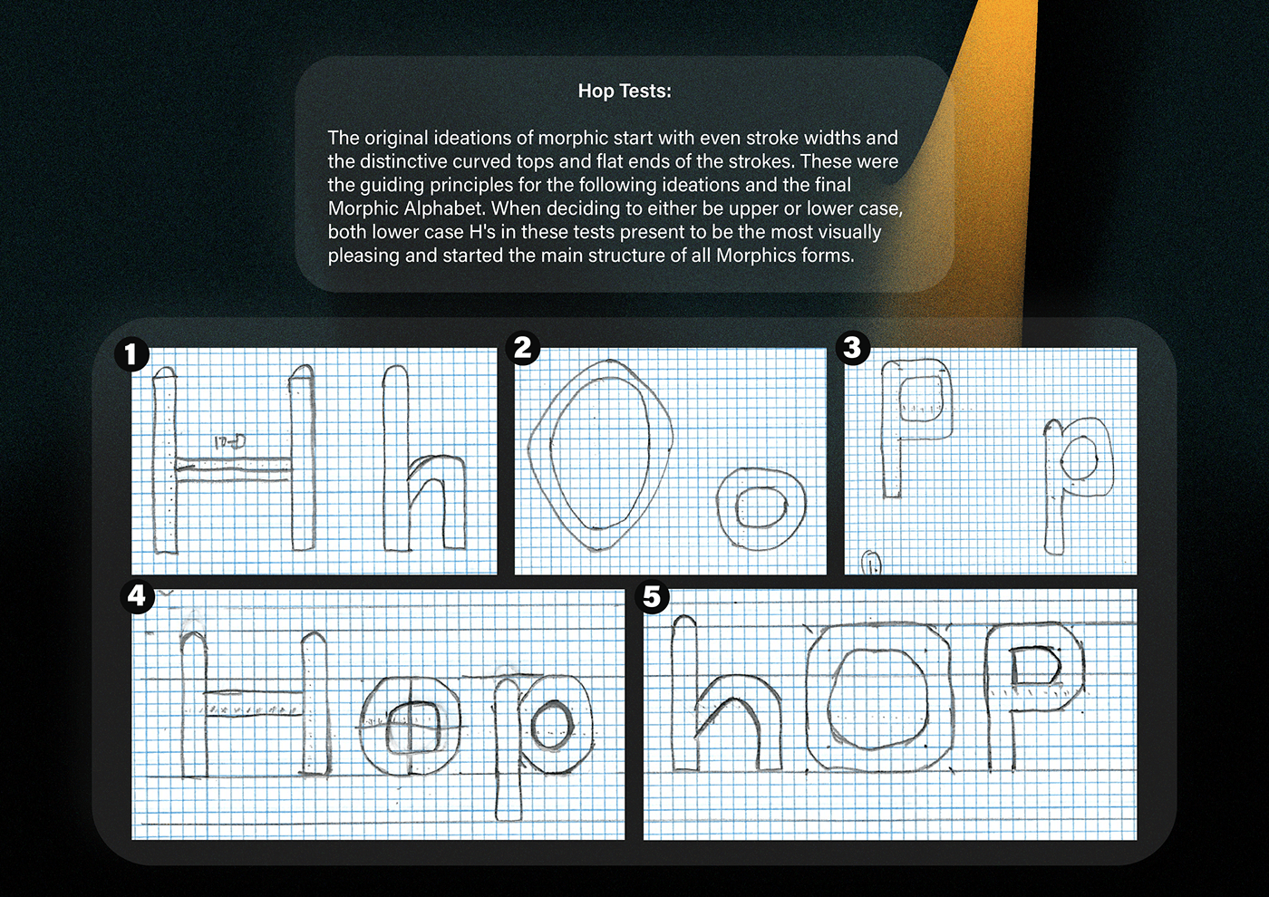
The fundamentals learnt within Typography and expression have been greatly utilised for the completion of the typeface Morphic. When stated my original intention in the ideation stage of this course, I was told that a user interface with a san-serif font would be hard. At first, I didn't believe this, but in the last 10 weeks past, I can now say that yes, a user interface san-serif font was hard to make. The intricacy in ensuring all principles of neo-grotesque fonts were appropriately involved within the Morphic typeface, presented a harder task than originally anticipated. The complexities of legibility and clarity played a larger role in the idealisation and correction phases of this font and heavily relied on the inspiration of other typefaces to ensure my body of work was completed to high standards in regards to san-serif fonts. The trial and error of ensuring this was extensive but, I can gladly say that I've completed a typeface that I'm visually proud of and would love to explore a range of Uppercase Morphic letter variations for future design adventures.


